A new fair, built to feel like it's been here for decades.
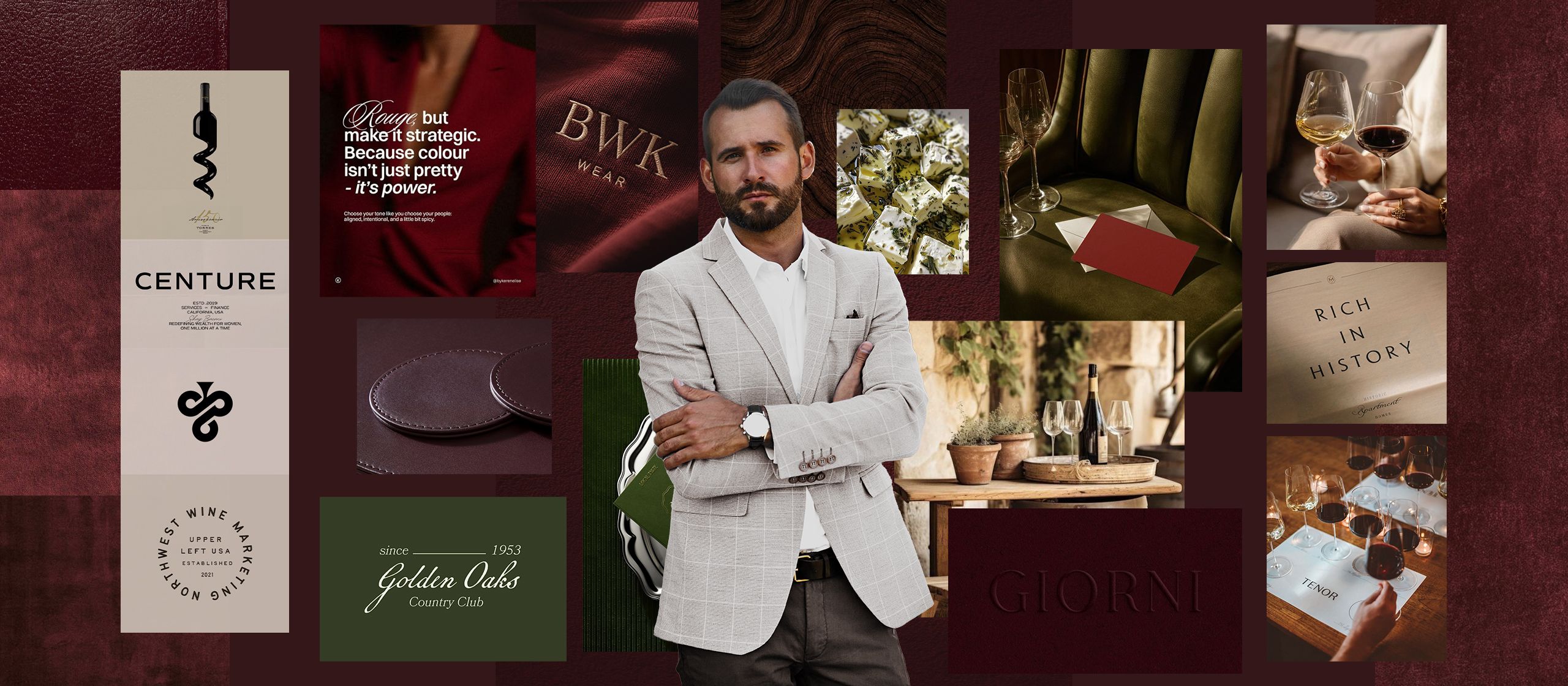
Ukusi Morave brings the region's best wine, rakija, honey and food producers together in one place. We built its identity from scratch, rooted in the region's rivers, wine and tradition, and carried it into every detail guests can see and touch. From day one, it looked and felt like a premium fair, for exhibitors and visitors alike.
- Price
- 3000€
- Deadline
- 4 weeks
- Year
- 2023.
Challenge
Ukusi Morave is a new food and drink fair from the Morava region. It gathers local producers of wine, rakija, honey and traditional food, with tastings and talks for visitors.
A new event has no name to lean on. Without a strong identity, it would have looked like one more local fair, and it needed to win over serious producers and their guests before the first edition even opened.
We agreed on a complete brand identity: the logo system, the visual system, and the materials for the fair itself, from invitations to on-site details.
From its first edition, Ukusi Morave looked and felt like a high-end fair, the kind producers want to be part of.
“Stefan perfectly blended the traditions of our region with clean, timeless design, beautifully reflecting authentic quality. Pure professionalism!”
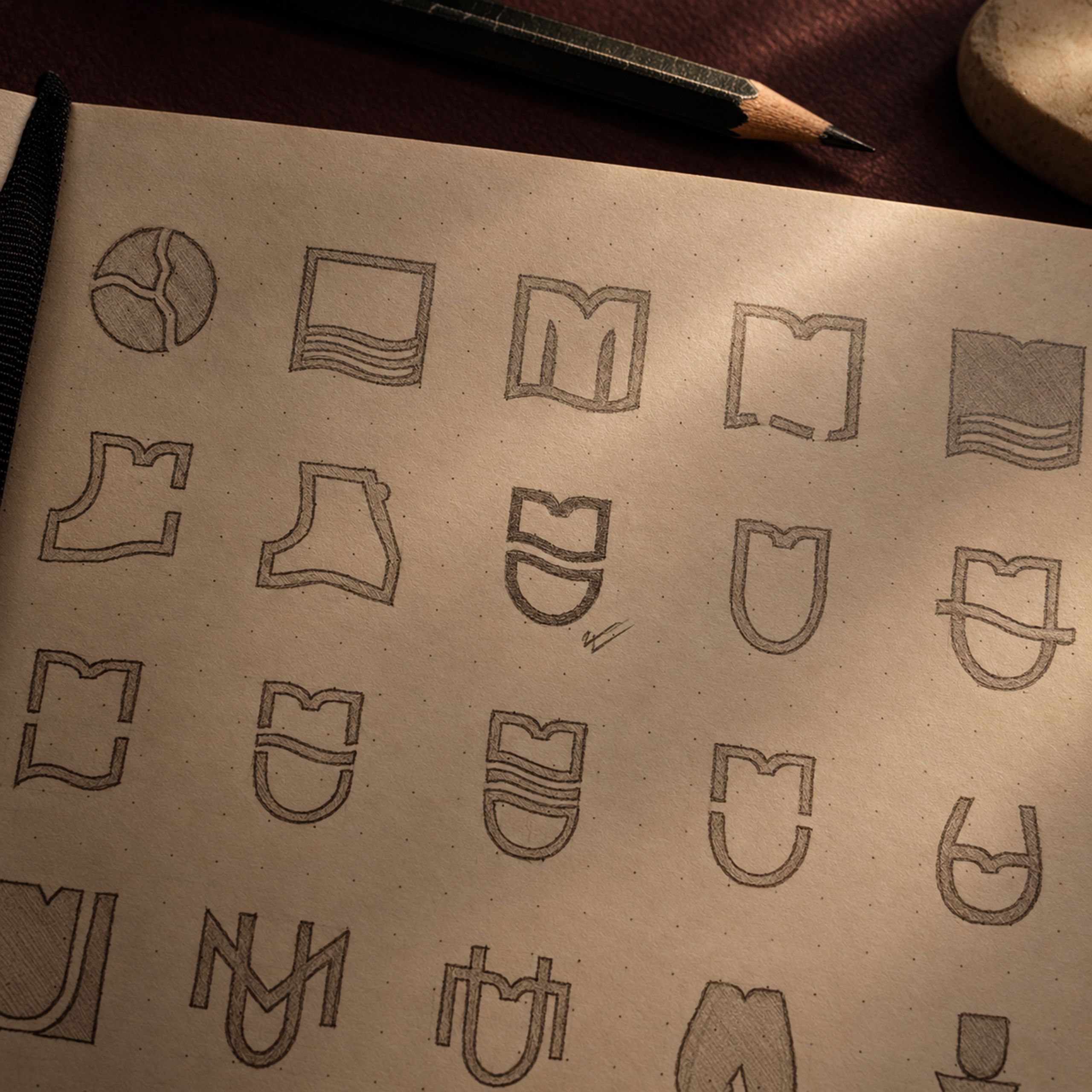
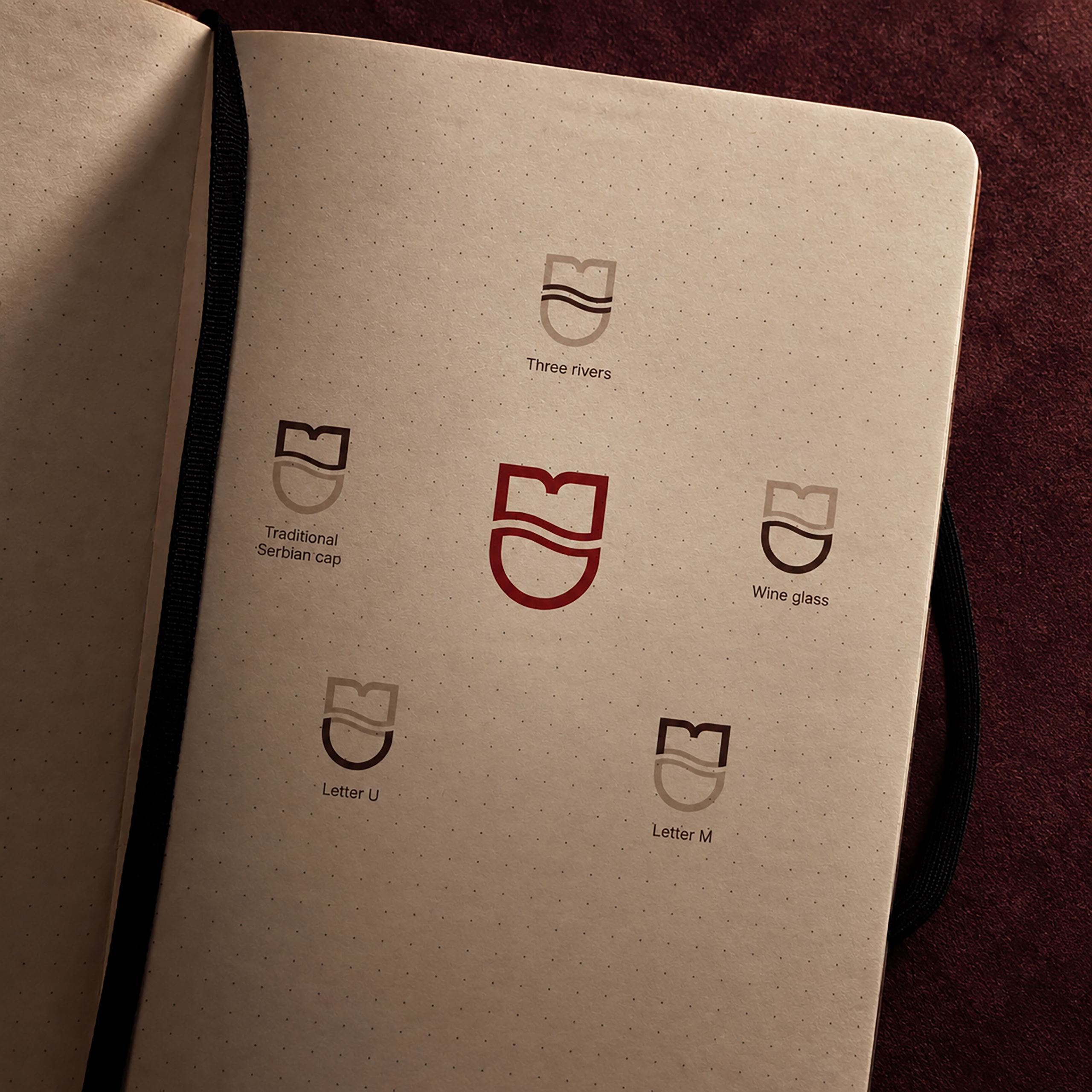
Five symbols in one mark.
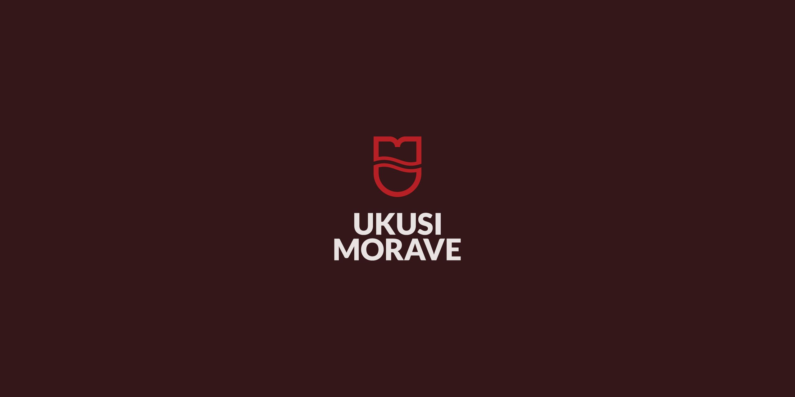
The letters M and U, a traditional Serbian cap, three rivers and a wine glass, combined into a single symbol. It tells the story of the region and stays clear at any size, from a small label to a large banner.
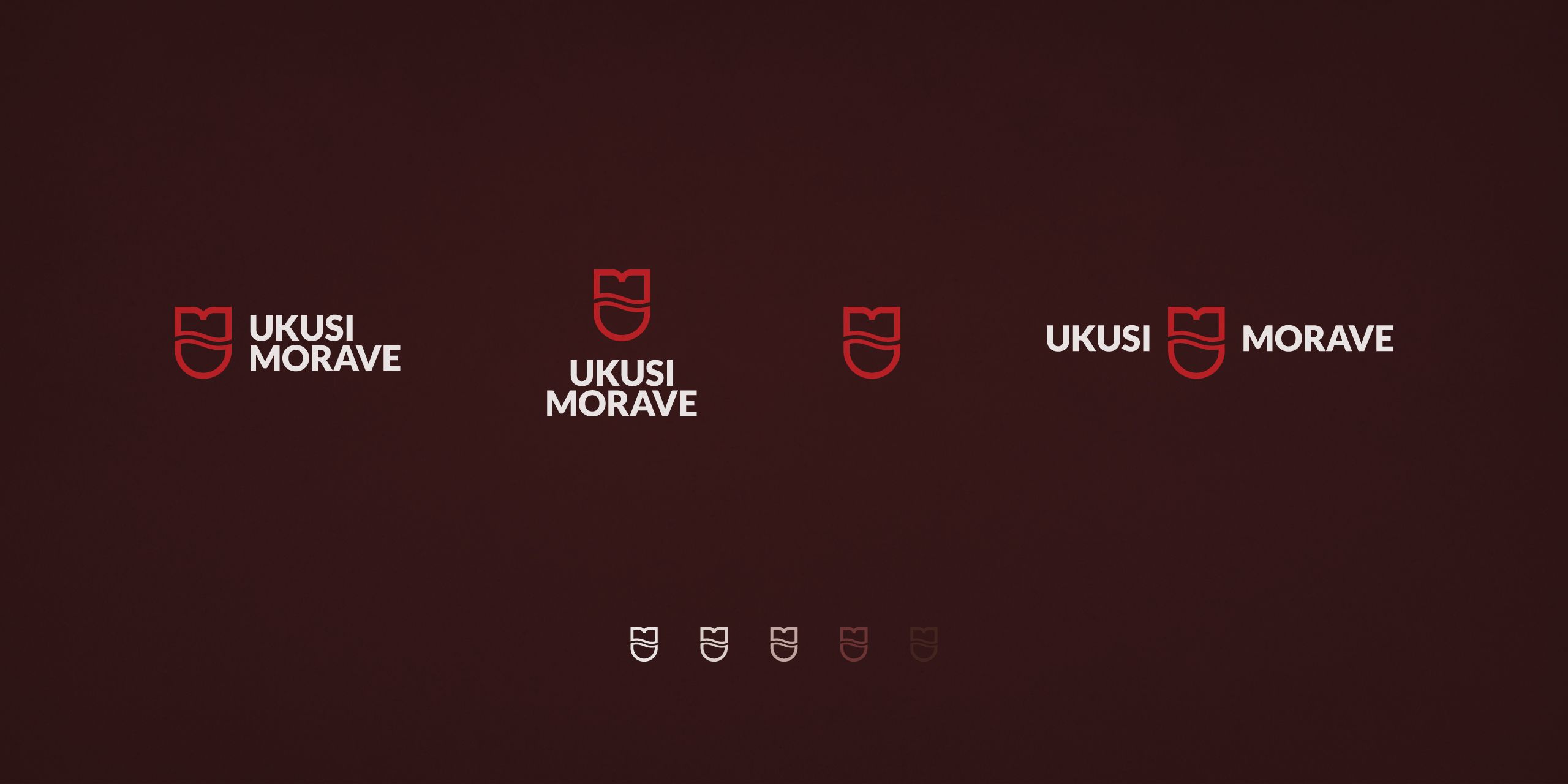
Wine red as the main brand color.
Wine is at the center of the fair, so red was the natural place to start. It ties every print and digital piece together, so everything clearly belongs to one fair.
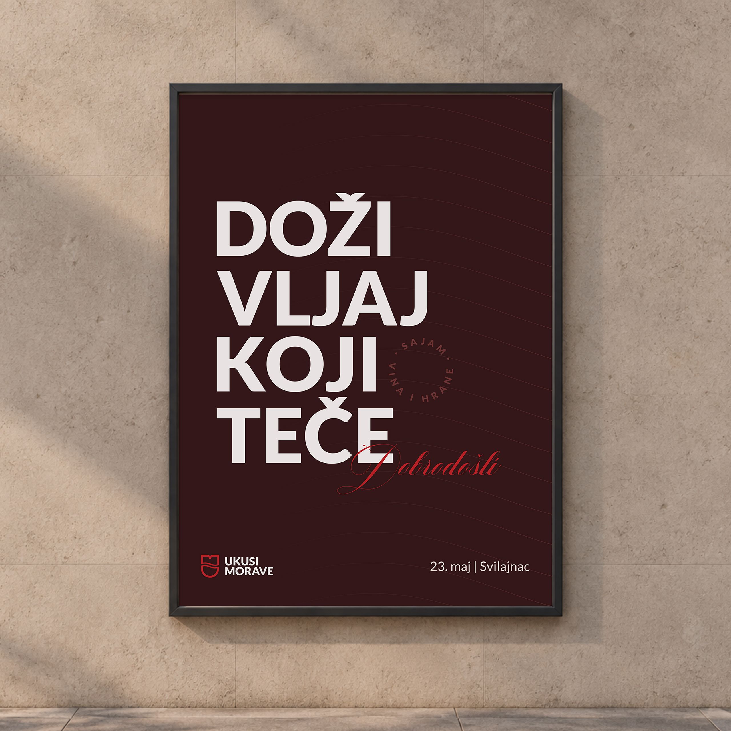
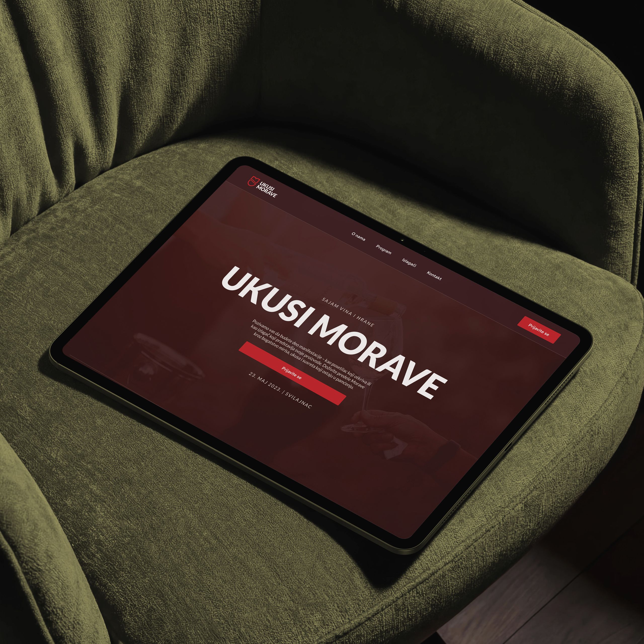
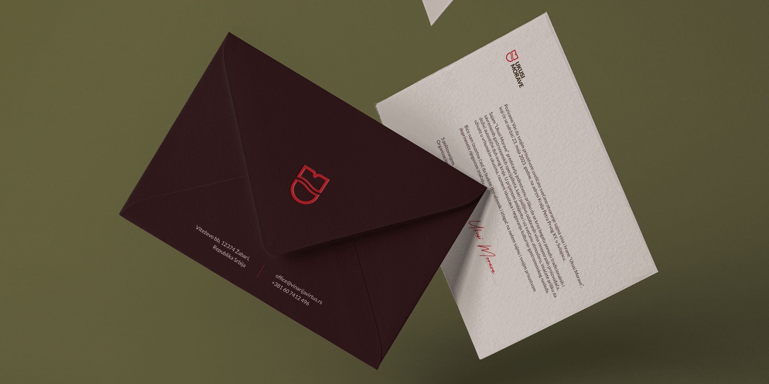
Printed invitations for every exhibitor.
Each exhibitor received a personal invitation on textured paper, in a matching envelope. A letter takes more effort than an email, and that effort shows producers the fair takes them seriously.
Real materials, down to the smallest detail.
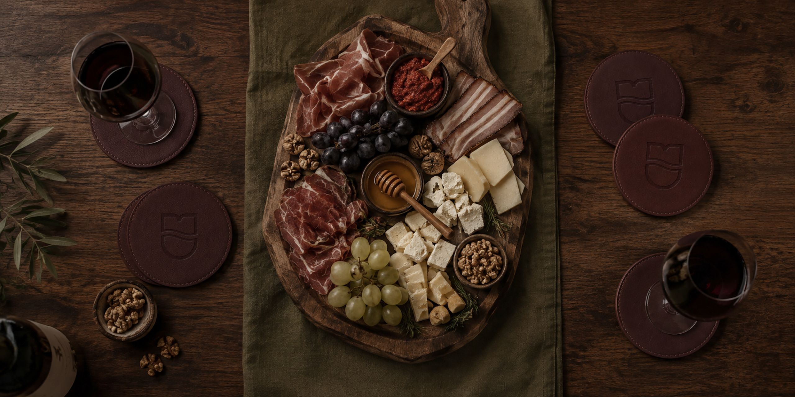
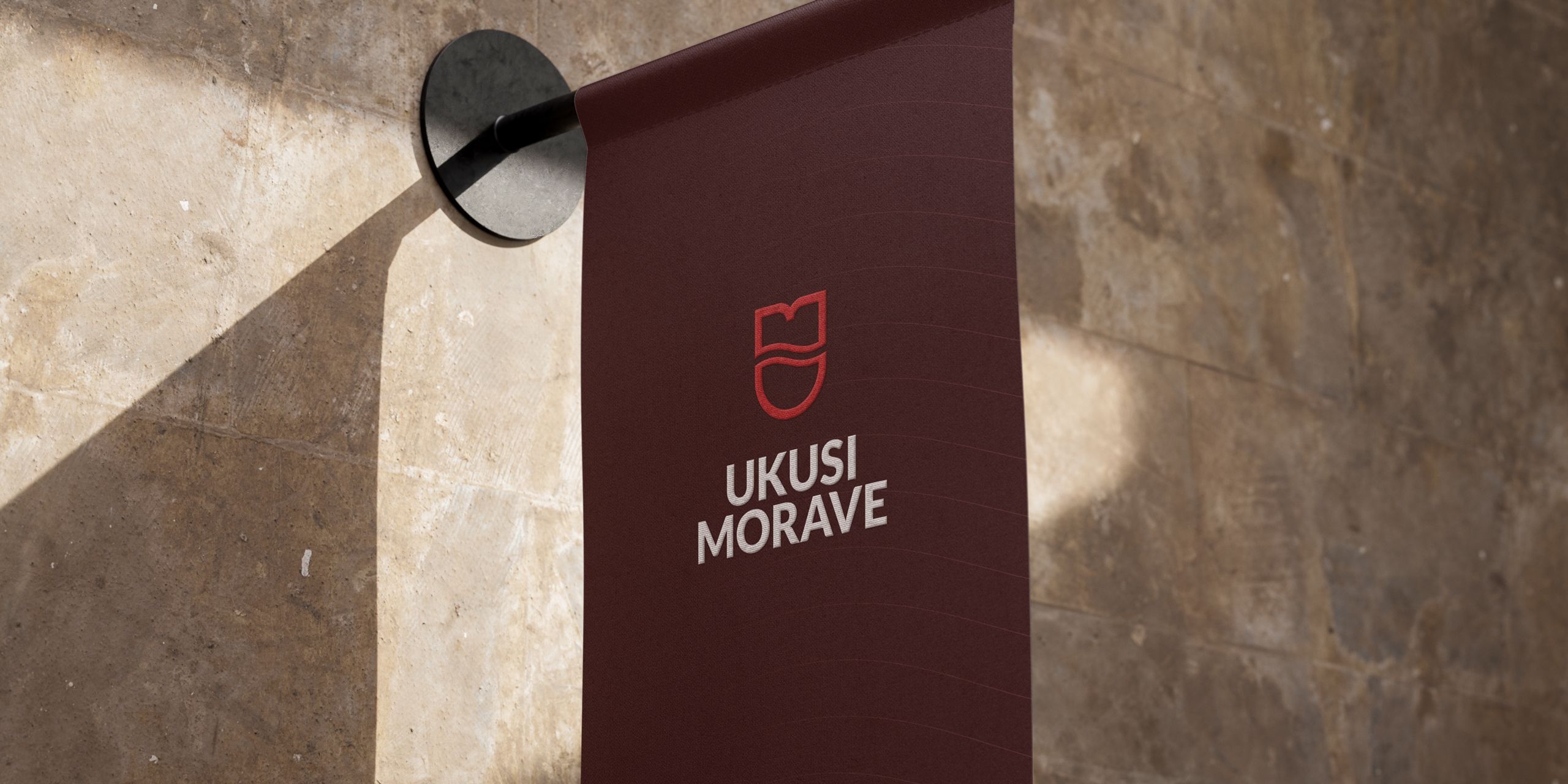
The symbol is stitched into the flags and embossed into leather coasters. These are small touches, but they make the whole fair feel carefully made.