One master brand, ready for every new branch.
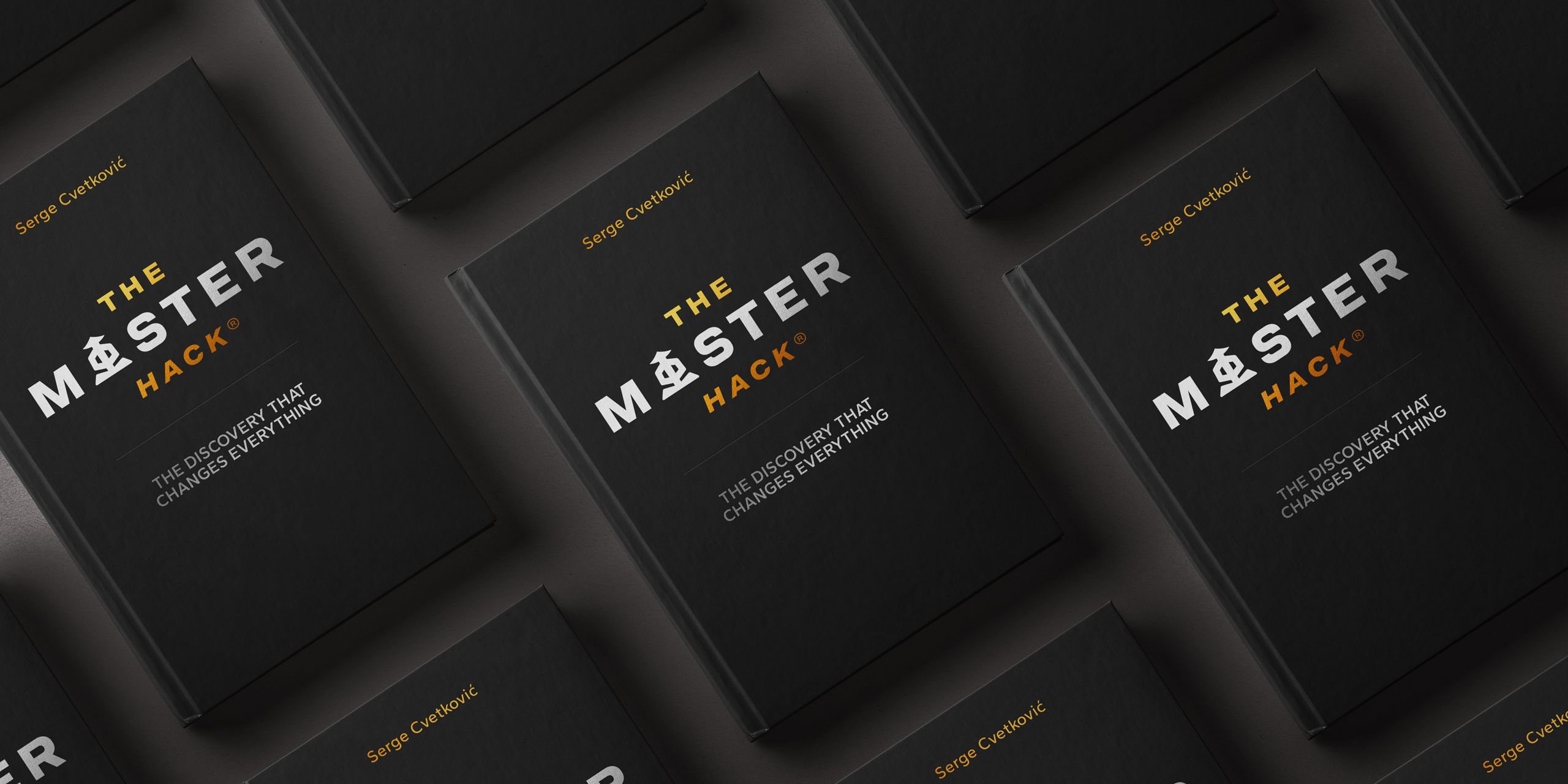
MASTER is Serge's practice for bringing the lessons of Eastern martial arts into modern life. We built its first real identity as a master brand that new sub-brands can grow from, and carried it from posters and emails to a full website with an online learning platform. The business now has one clear system to grow on.
- Price
- 6500€
- Deadline
- 8 weeks
- Year
- 2026.
Challenge
Serge runs MASTER, a personal development practice in Switzerland inspired by martial arts, adapted for modern life: career, sport and everyday challenges. He works with clients in training spaces and online.
The business worked, but it had no defined brand. Serge was ready to grow it into several smaller brands, and without one strong identity at the center, each new brand would have looked like a separate business.
We agreed on a master brand identity that sub-brands can build on, for print and online materials, and the design of the whole website, including its learning platform.
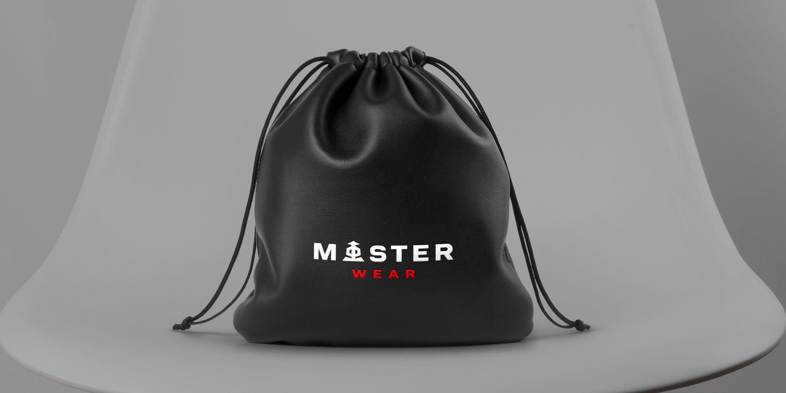
The master brand identity was extended across the sub-brands, creating a clear visual connection between them.
“100% professional. Demonstrates creative, conceptual, and strategic design thinking.”
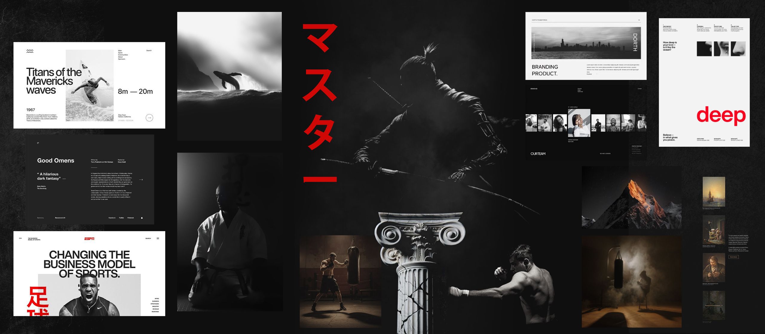
Eastern tradition shaped by Swiss minimalism.
The mark, symbols and colors draw on the tradition, culture and mysticism of Eastern martial arts. Swiss minimalism, a style built on clean grids and few elements, keeps it all calm and clear.
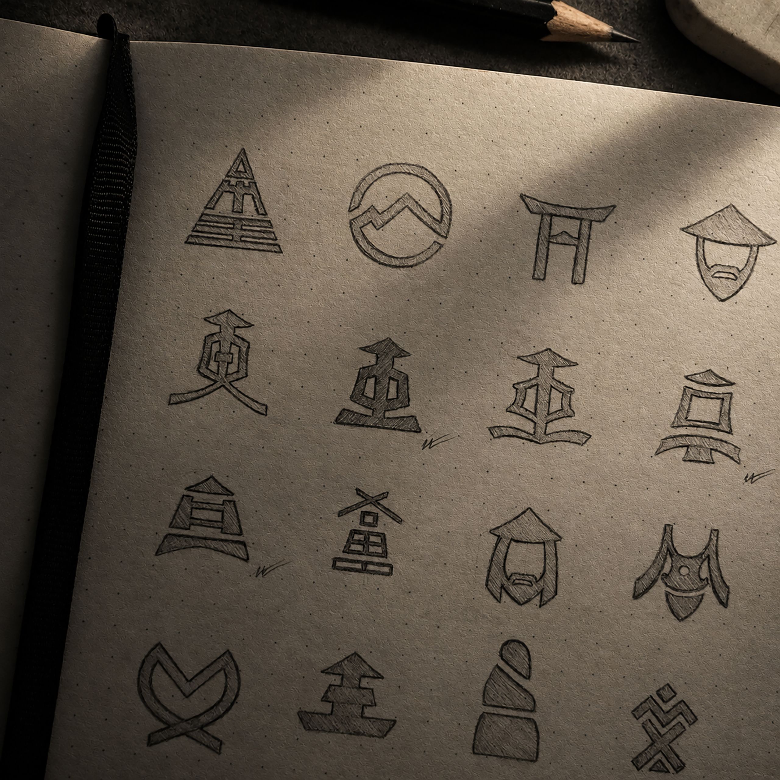
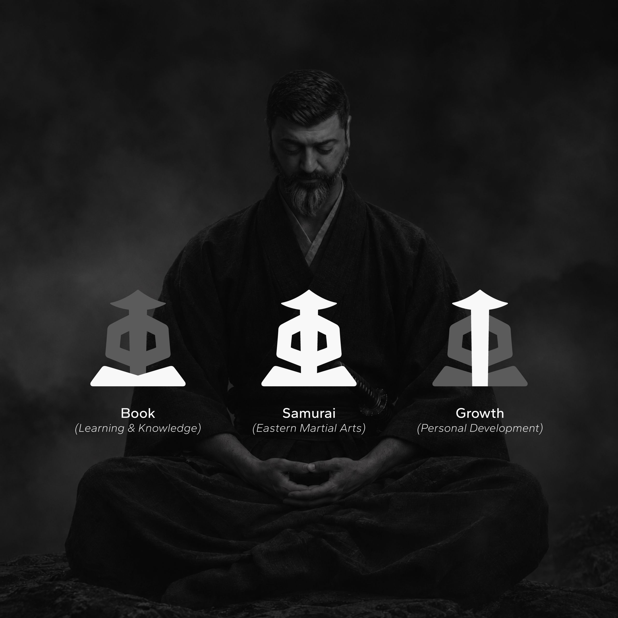
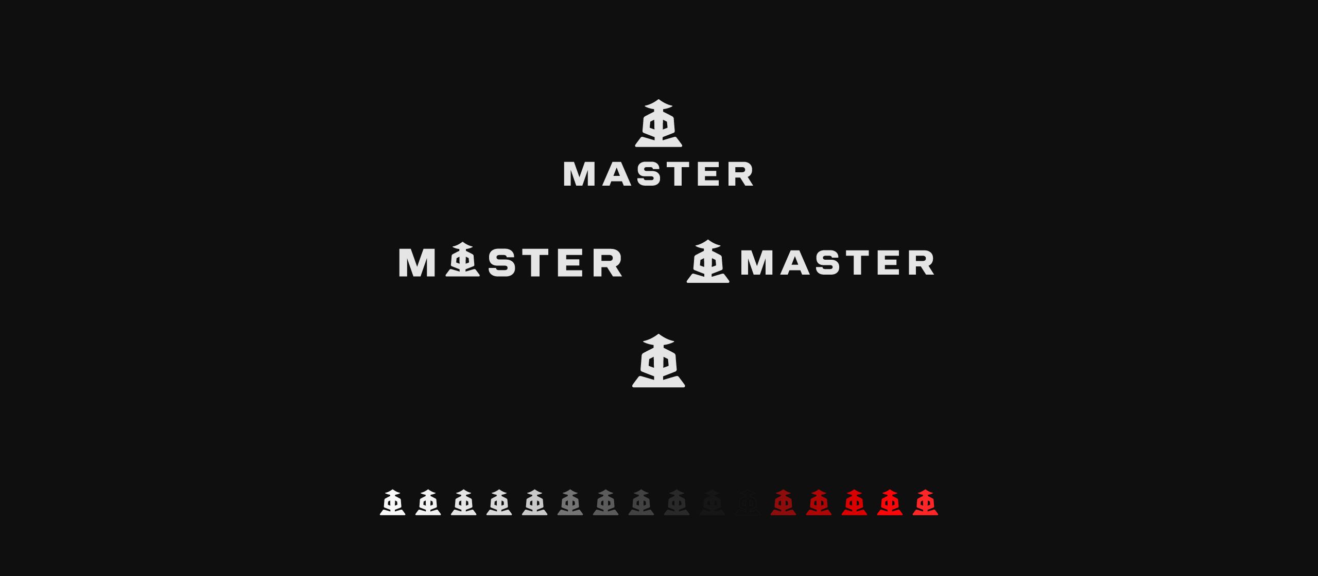
From the city streets to the training room.
Posters, signs and flyers promote MASTER across Zurich, in the streets around the training space and inside it. Clients also get the same materials in digital form, so the brand looks the same wherever they meet it.
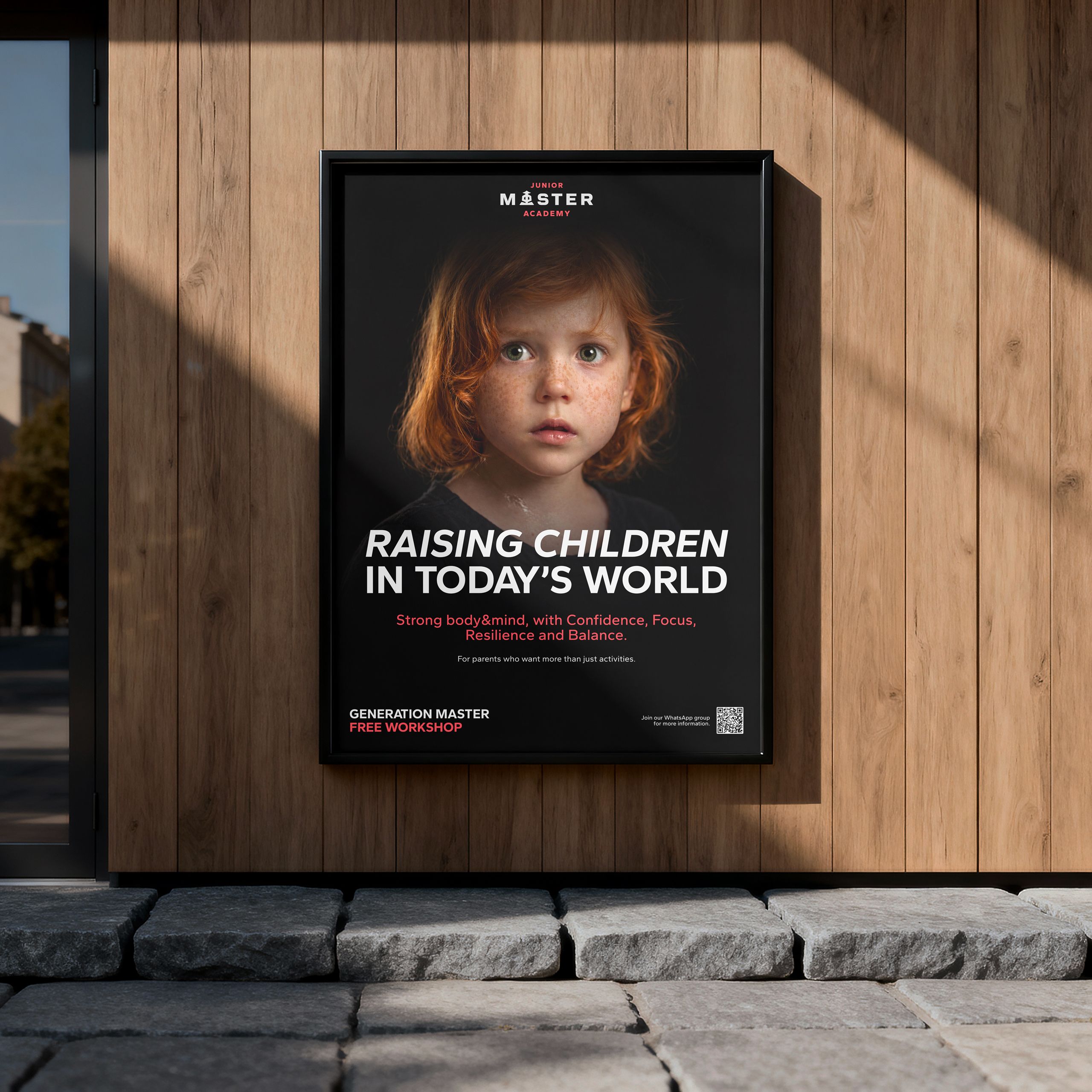
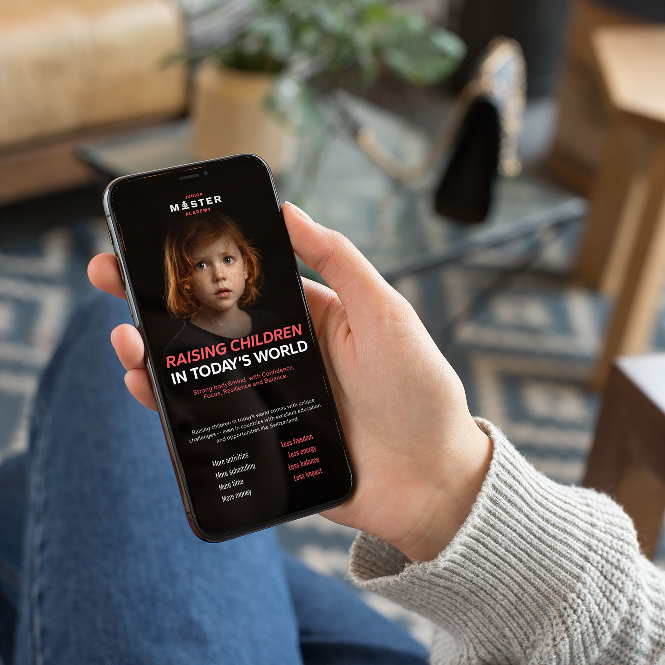
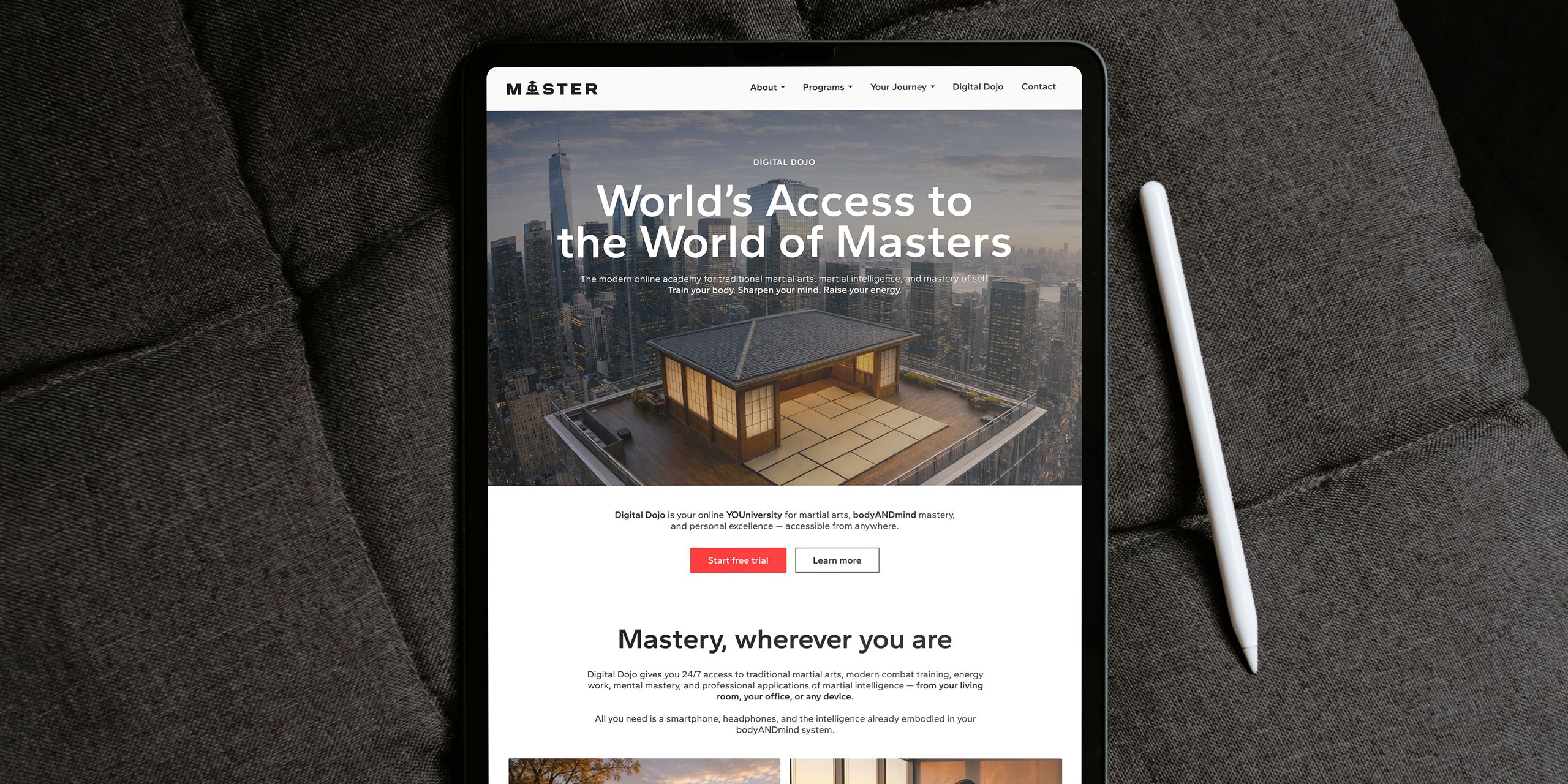
A website with a Digital Dojo inside.
One design system keeps both parts consistent and easy to recognize: the marketing pages that present MASTER to new clients and the digital dojo, the online platform where they learn and train.
Sub-brands that clearly belong to MASTER.
Each sub-brand keeps the master identity and adds its own color and an addition to the logo. Clients see right away that it is part of MASTER, and which part.