One drawing that tells a whole distillery's story.
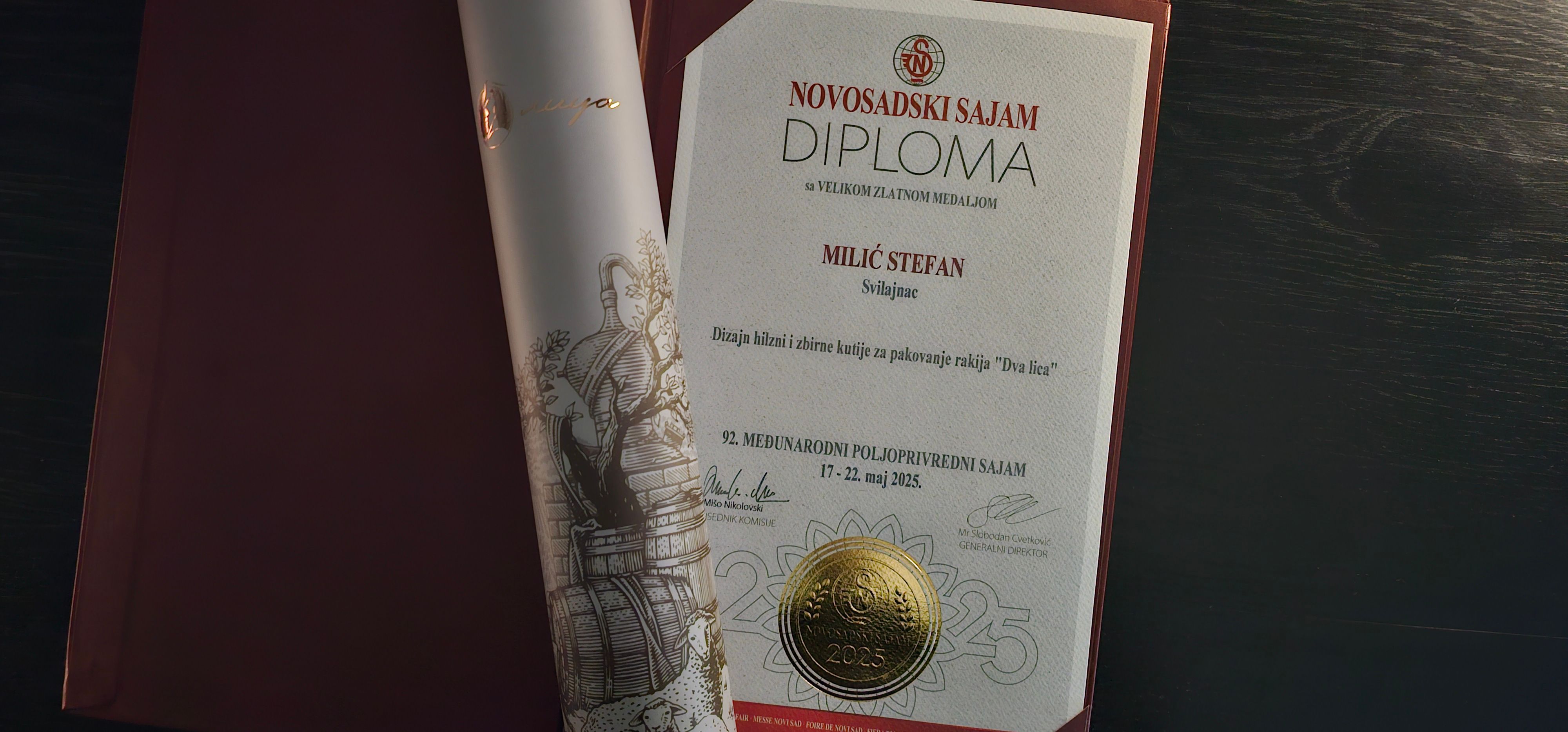
Dva lica made exceptional rakija, but had no packaging to show it. We built a packaging system around one hand-drawn illustration of their story, carried across eight varieties, a copper-foiled tube and print. It won a Grand Gold Medal for packaging design at the 92nd International Agricultural Fair in Novi Sad.
- Price
- 2000€
- Deadline
- 3 weeks
- Year
- 2024.
- Credits
- Product photography - Danijel Milić
Challenge
Dva lica, Serbian for "two faces", is a premium rakija distillery started by two friends, Nebojša and Toplica. The name stands for the two of them, and for a rakija that is rustic and refined at once.
The rakija is made the traditional way, from fruit they grow themselves with an organic approach. They had a logo, but no packaging that showed any of this, so there was nothing to set it apart from competitors.
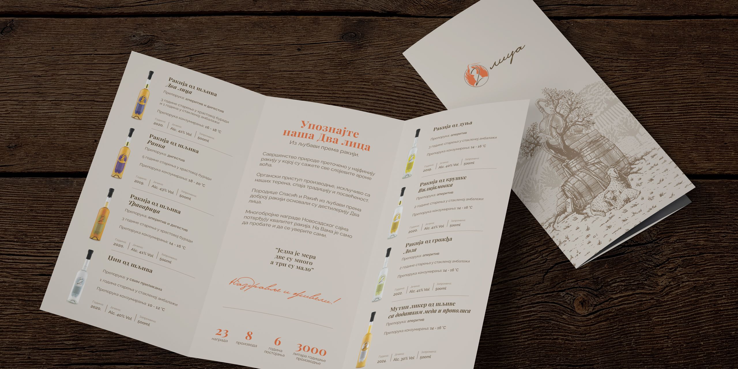
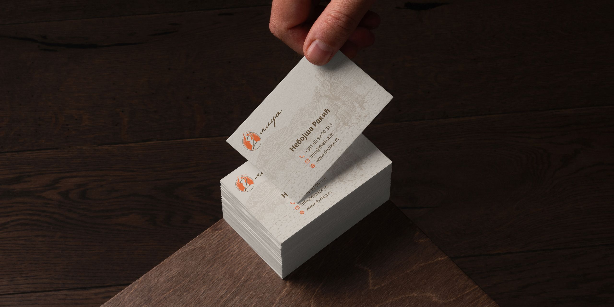
We agreed on a packaging system that tells their story simply and works across eight rakija varieties, plus a brochure and business cards.
The rakija is the same as before, but it now looks as premium as it tastes, with a Grand Gold Medal for packaging design to prove it.
“Stefan managed to translate the character of our spirit, our way of working, and the emotion behind the brand into packaging that carries the soul of our rakija.”
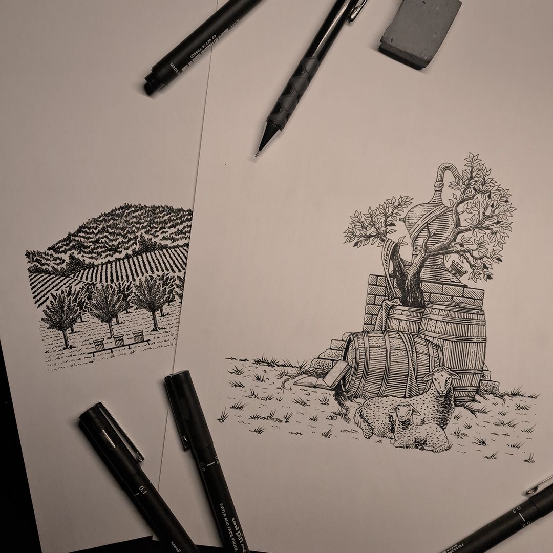
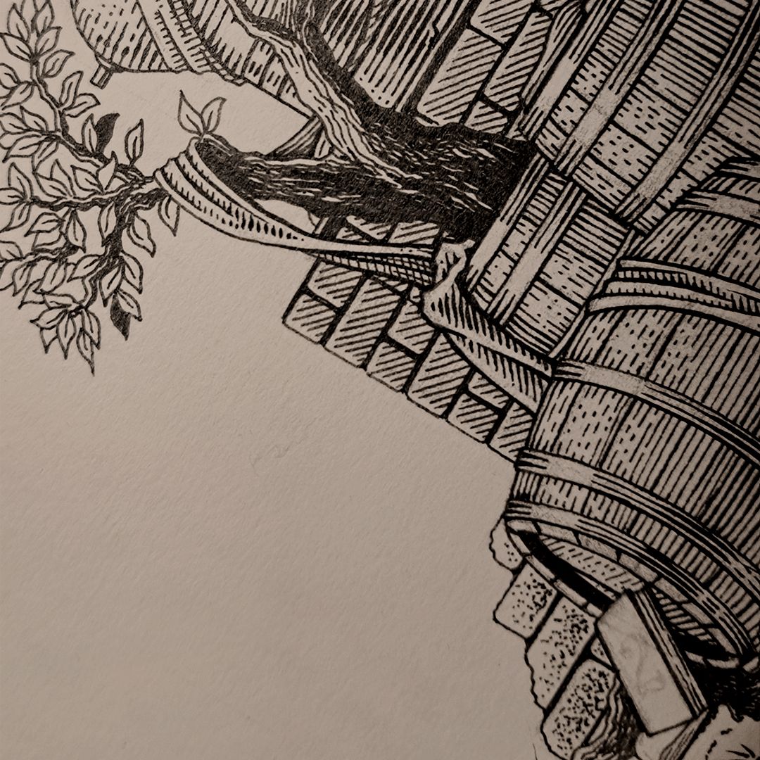
A hand-drawn illustration, every element with meaning.
Drawn line by line, with no stock images: roots for tradition, books for knowledge, the still and barrels for distillation, orchards in the background. The lamb is a quiet symbol of the founders' Orthodox faith.
One bottle, one structure, a color for each.
All eight varieties share the same 500 ml bottle and label layout, and only the name and color change. The range reads as one family, and a new variety is easy to add.
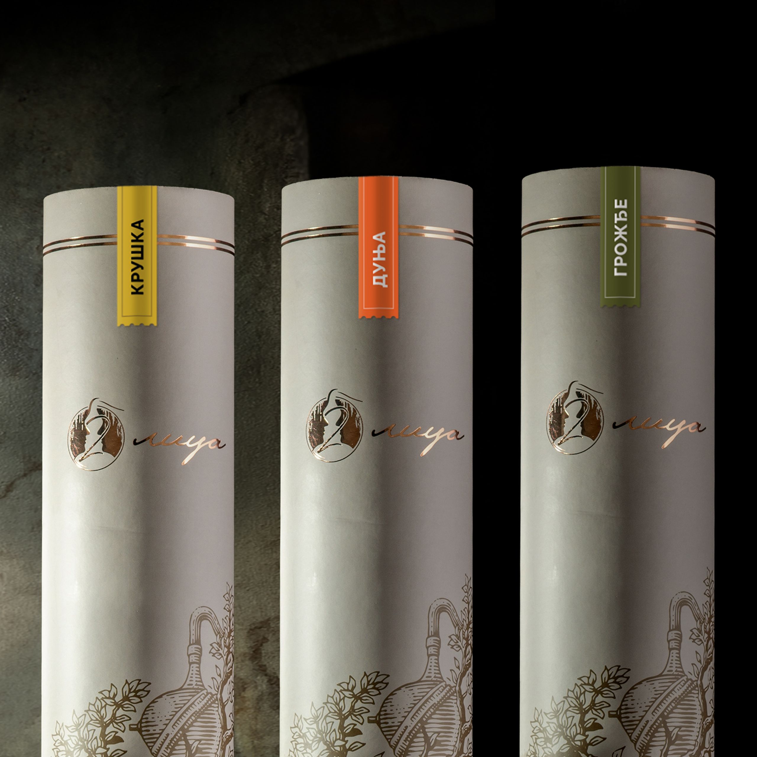
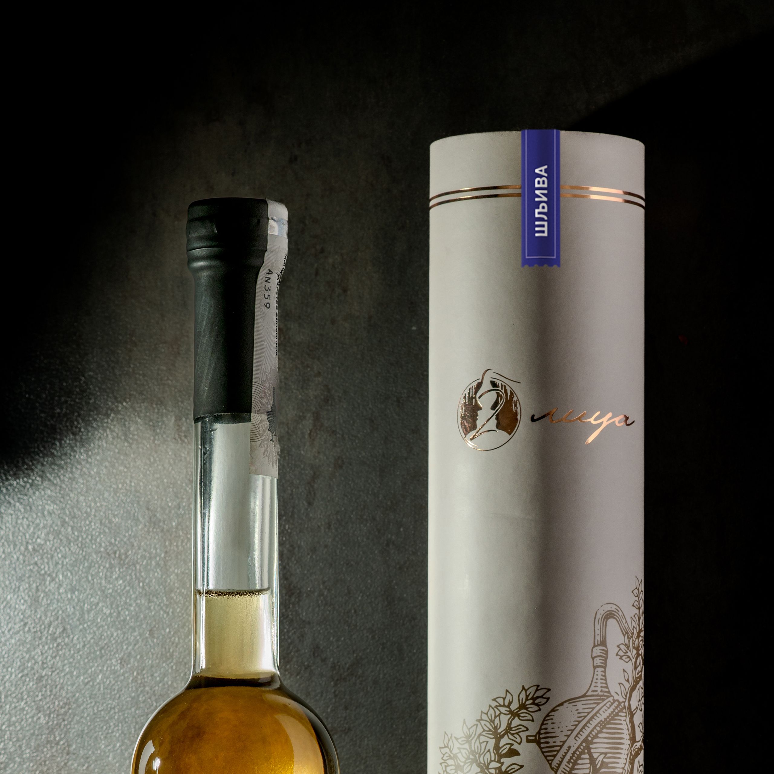
A round tube with copper, not gold.
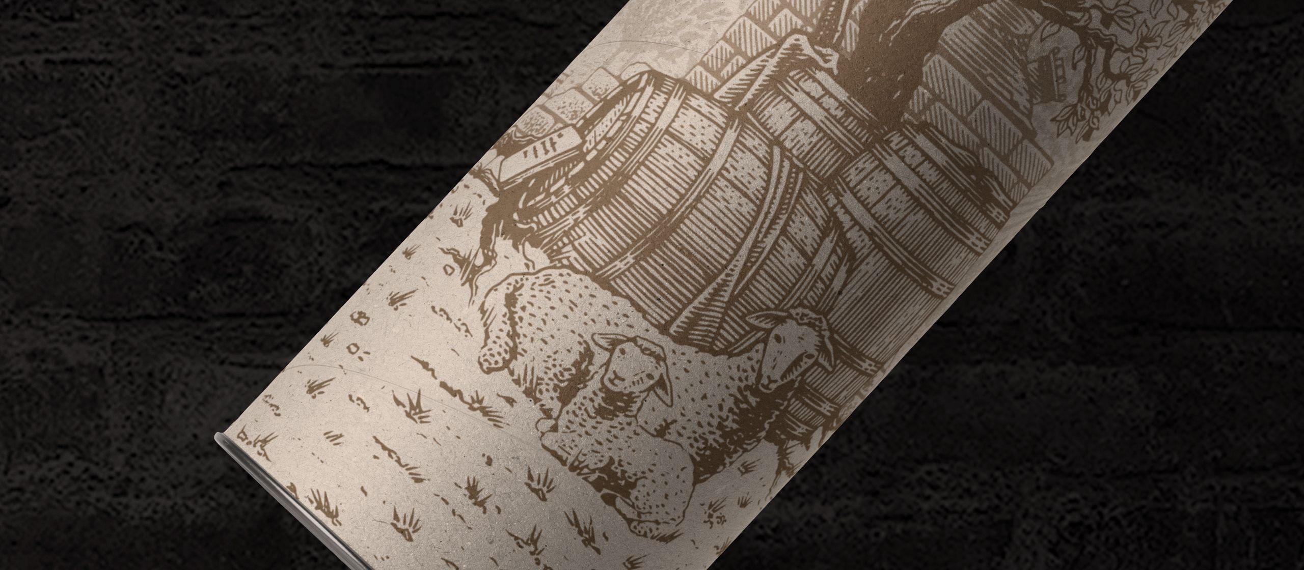
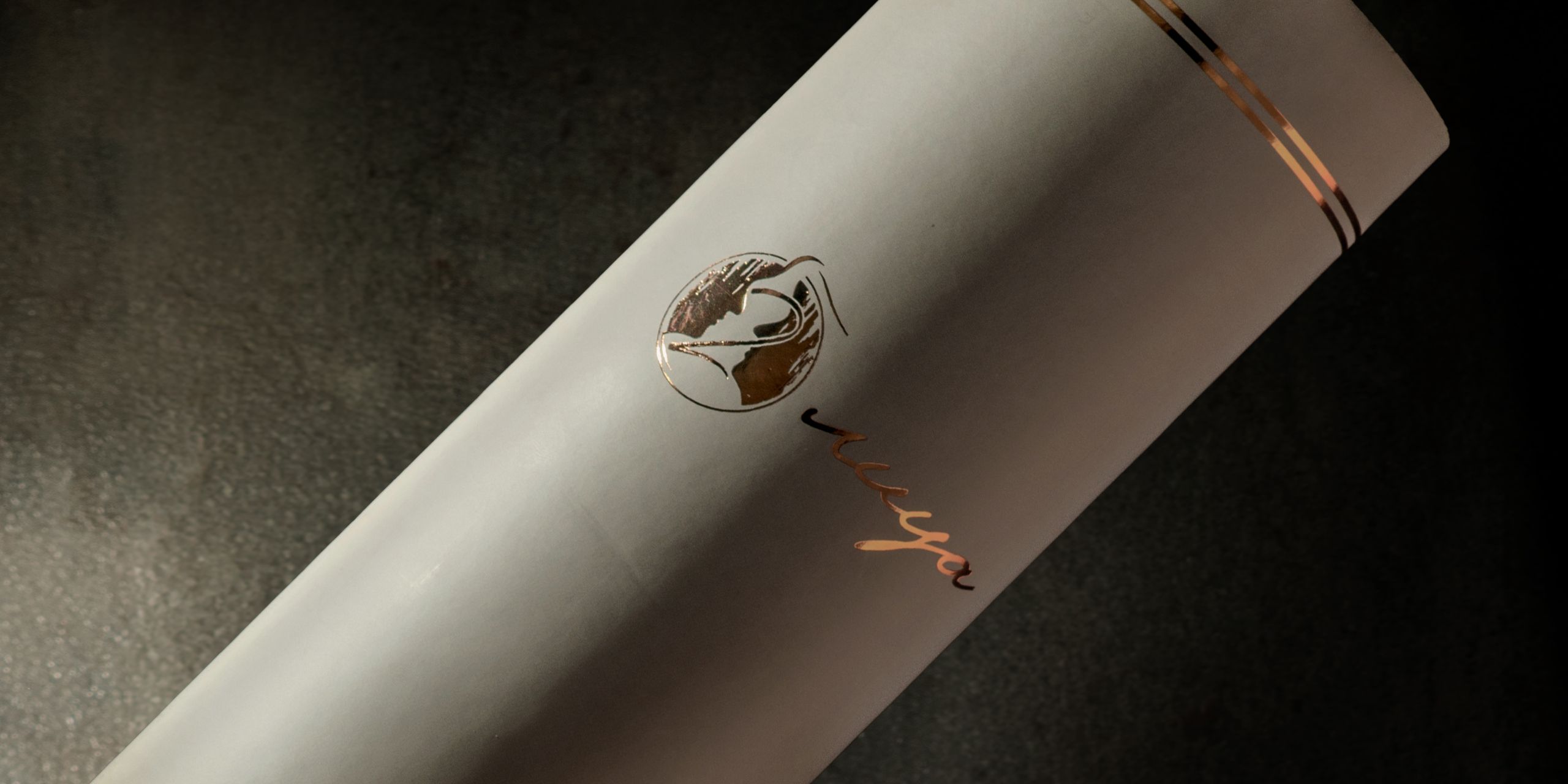
Instead of the usual rectangular box, each bottle comes in a cylindrical tube. Copper foil picks out the key details and feels premium without the gold finish so many bottles rely on.
The same drawing, carried into print.
The brochure and business cards carry the same hand-drawn illustration. The brochure tells the distillery's story in full, for anyone who wants to know who is behind the rakija.